
Understanding the Consultant Dashboard in Hoicko
Updated 9/2/20263 min read
The Consultant's Dashboard exists to answer, in about five seconds, a question that would otherwise take several minutes of scrolling and filtering the Reports table to answer: "how is my/our work actually going right now?" Instead of hundreds of individual rows, it presents pre-aggregated, real-time numbers and charts — genuinely the fastest way to start a workday with the right priorities already visible.
Reading the dashboard's tab row
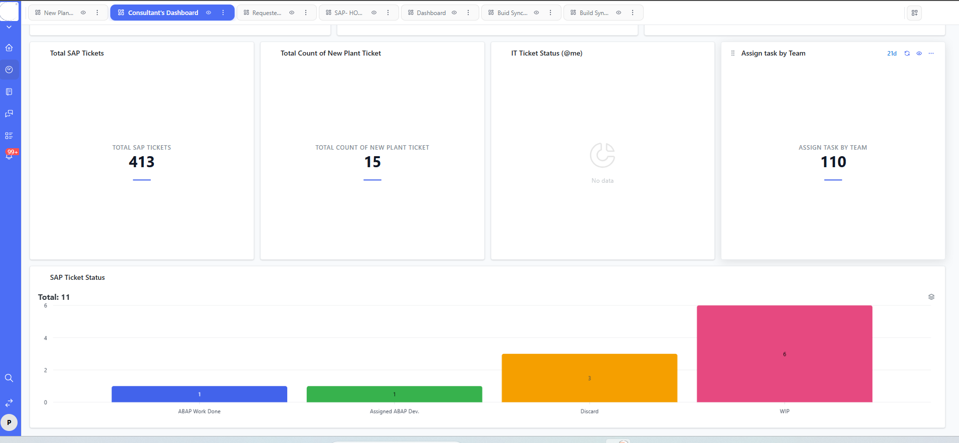
Across the top of the dashboard screen sits a row of tabs — New Plan..., Consultant's Dashboard, Requeste..., SAP-HO..., Dashboard, Buid Sync..., Build Syn... — reflecting the fact that different stakeholders often need differently-tuned views over the same underlying data. A consultant, a requester, and a project lead for a specific workstream like Build Sync will each naturally gravitate to a different tab.
The four summary widgets
- Total SAP Tickets — a running, all-time count of every SAP ticket ever raised (for example, 413). Treat this as your long-term volume indicator, not something you expect to change meaningfully day to day.
- Total Count of New Plant Ticket — a filtered count specific to "New Plant" related tickets (for example, 15), useful whenever a specific rollout or plant needs isolated visibility separate from the general ticket pool.
- IT Ticket Status (@me) — a personal widget filtered to only tickets assigned to the logged-in consultant. It's entirely normal for this to display "No data" — that simply means you have zero assigned IT tickets right now, not that anything is broken.
- Assign Task by Team — a count of tasks currently distributed across teams (for example, 110), a useful early signal for spotting workload imbalance before it becomes a real bottleneck.
The SAP Ticket Status bar chart
Below the four summary cards, a bar chart breaks down currently open tickets by lifecycle stage — for example, ABAP Work Done (1), Assigned ABAP Dev. (1), Discard (3), and WIP (6) — with a running Total shown at the top-left (for example, "Total: 11"). This chart is, in practice, the single most useful widget on the whole dashboard, because its tallest bar directly points to wherever your team's biggest current bottleneck actually is.
How to use this dashboard as a daily habit
Start every workday on this dashboard, before opening the raw Reports table. The bar chart instantly tells you where to focus — in the example above, WIP is clearly the dominant bucket, meaning that's where attention should go first, rather than spreading effort evenly and inefficiently across every stage.
FAQs:
Q 1. Why does "IT Ticket Status (@me)" show "No data"?
It means you currently have zero tickets in that filter.
Q 2. Total SAP Tickets vs. chart total — difference?
Total is all-time; the chart total is usually active/open tickets only.
Q 3. Can I click a chart bar to see underlying tickets?
Typically yes, it drills down to the filtered list.
Q 4. Assign Task by Team vs. Total SAP Tickets — difference?
The former is a broader workload metric, not just raw ticket count.
Q 5. Can each consultant get a personalized dashboard?
Yes, especially "@me" filtered widgets.
Q 6. How often does the dashboard refresh?
Near real-time, with a manual refresh option available.
Related content
Is this article helpful?
Help us improve our articles.