
Key Metrics Explained
Updated 9/2/20262 min read
A number on a dashboard is only genuinely useful if you know what decision it's supposed to inform. This article goes beyond simply defining each metric and explains how to actually act on it — what a rising number should make you do differently, and what a falling one tells you.
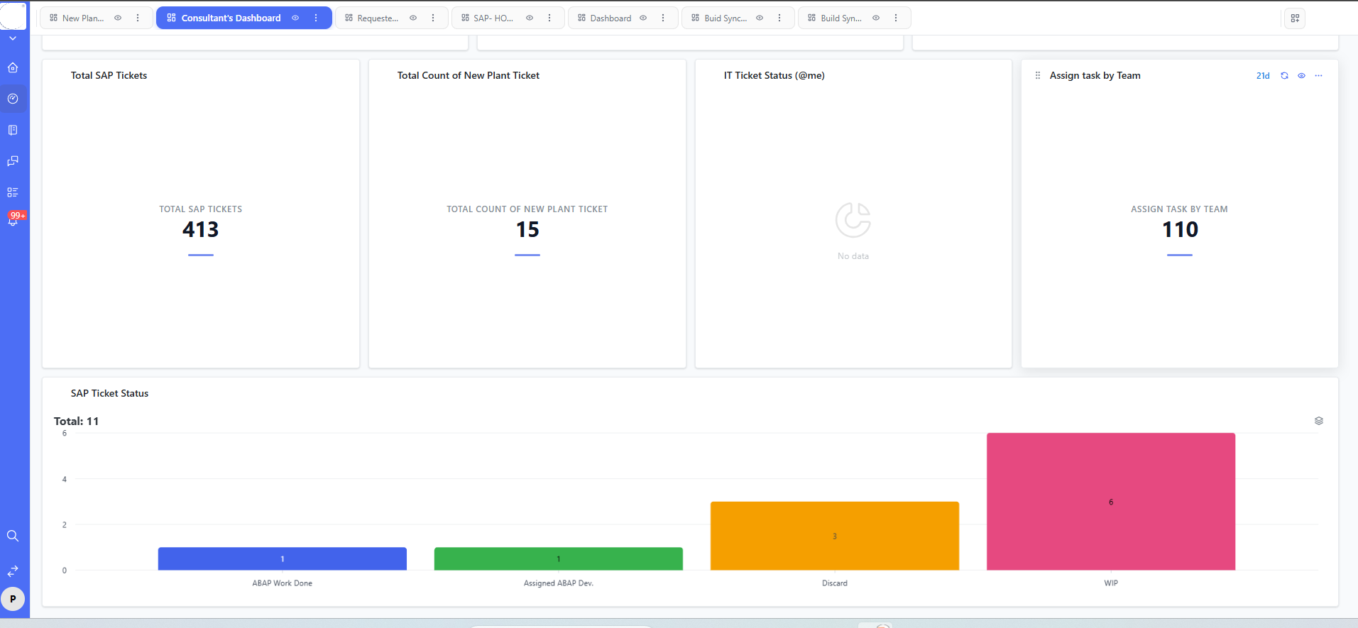
Total SAP Tickets — an all-time volume indicator
A steadily rising total is normal, and often a healthy sign — it usually reflects growing adoption of the ticketing process itself, not necessarily a growing number of underlying problems. The correct way to read this metric is over time (week over week), never as a single static number in isolation.
Total Count of New Plant Ticket — a segment-level signal
Use segment-specific counts like this to judge whether a particular rollout, plant, or project genuinely needs extra support resourcing right now, separate from the general ticket pool's trend.
IT Ticket Status (@me) — your personal workload gauge
This is your individual load indicator. If it consistently trends noticeably higher than your teammates' equivalent "@me" widgets over several weeks, that's a legitimate, data-backed signal worth raising with your team lead about rebalancing assignments.
Assign Task by Team — a team-distribution comparison
Compare this figure across team-specific dashboard tabs (like "Buid Sync..." or "Build Syn...") to spot whether one team is consistently carrying more load than another — a pattern that's very hard to see just by eyeballing the raw Reports table, but jumps out immediately on this widget.
SAP Ticket Status chart — your bottleneck detector
The tallest bar on this chart is your single best clue about where tickets are genuinely getting stuck. In the reference example, "WIP" (6) and "Discard" (3) dominate the chart — and a high Discard count specifically is worth investigating on its own, since it often points to duplicate submissions or unclear intake forms rather than genuine resolved-and-closed issue volume.
A simple weekly habit worth adopting
Note the chart's running Total (for example, "Total: 11") every Monday morning. A shrinking total week over week means your team is resolving faster than new tickets are arriving — a genuinely healthy sign. A steadily growing total is an early warning worth acting on well before it becomes a full-blown SLA crisis.
FAQs:
Q 1. What does a high Discard count usually mean?
Duplicate or unclear tickets — worth reviewing your intake form.
Q 2. Is a rising Total SAP Tickets number bad?
Not necessarily — check it against the open/WIP bucket trend.
Q 3. How do I compare workload across two teams?
Switch dashboard tabs and compare their widgets side by side.
Q 4.Is a large WIP bucket always bad?
No, only if paired with rising Ageing Total figures.
Q 5. Can I export dashboard numbers for reporting?
Most tools offer an export/share icon on the toolbar.
Q 6. Why do different tabs show different totals for similar tickets?
Each tab is tied to a different board or filter set.
Related content
Is this article helpful?
Help us improve our articles.