
Understanding the Admin Dashboard
Updated 8/18/20262 min read
The moment you log in, the admin dashboard gives you a live snapshot of your entire learning ecosystem. Rather than digging through multiple screens, everything you need to know — who's active, what's delayed, and how the platform is performing — is visible at a glance. This article breaks down every section of the dashboard so you know exactly what you're looking at.
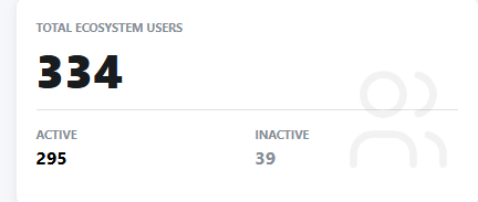
Total Ecosystem Users This widget shows the total number of users registered on your platform, split into Active and Inactive. Active users are those currently engaging with courses; inactive users haven't logged in or interacted recently. This is your first checkpoint for overall platform health — a growing gap between active and inactive users often signals a need for re-engagement campaigns or reminders.
Progression Risks This is one of the most important widgets on the dashboard. It flags two categories of risk:
- Course Delays — learners who haven't completed an assigned course within the expected timeframe
- Program Delays — learners falling behind on a multi-course program
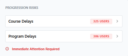
Both are marked with an "Immediate Attention Required" flag when numbers are high, helping administrators prioritize follow-up before delays snowball.
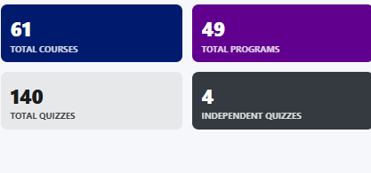
Content Summary Tiles Four compact tiles show your platform's content volume at a glance: Total Courses, Total Programs, Total Quizzes, and Independent Quizzes. These numbers help you understand how much content has been built and whether your content library is growing in line with your training goals.
Program Performance Distribution This section breaks learners into four performance buckets — Program Passed, Program Failed, Program Unattempted, and In Progress. Each number is clickable, taking you to a detailed, user-level breakdown, so you're never just looking at a static number without the ability to act on it.

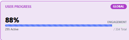
User Progress (Global Engagement) Displayed as a percentage with a progress bar, this metric shows overall learner engagement across the platform, along with a breakdown of how many users are active out of the total.
Ecosystem Progress At the bottom of the dashboard, this section shows your overall certification and completion rate as a percentage, along with three clear categories: Certified, In Progress, and Delayed learners. This is often the number leadership teams care about most, since it summarizes training effectiveness in a single figure.
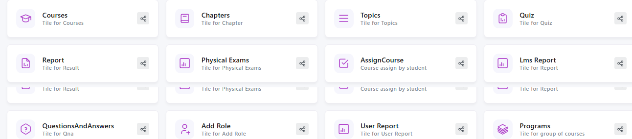
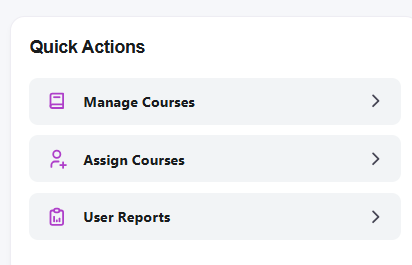
Quick Actions Panel For faster navigation, the dashboard also includes a Quick Actions panel with shortcuts to Manage Courses, Assign Courses, and User Reports — so frequent tasks don't require digging through menus.
Together, these widgets are designed to answer one core question at all times: is our training program working, and who needs help right now?
FAQs:
What does the Progression Risks widget show?
It flags course delays and program delays that need admin follow-up.
What is the User Progress metric?
A global engagement percentage showing how many active users are progressing through content.
Related content
Is this article helpful?
Help us improve our articles.